


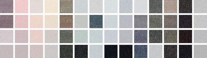
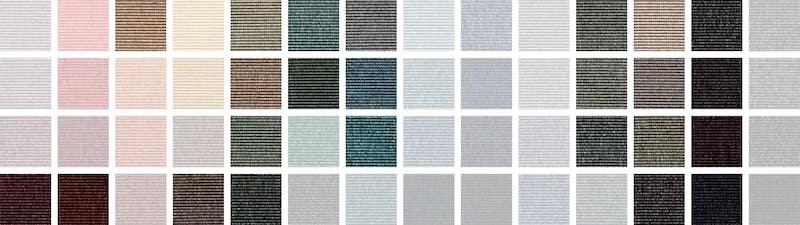
Featuring 56 eternal colours developed by Margrethe Odgaard
and examples from the Eco concept, including our most sustainable collections to date
Are you in love with colours but still holding back a little, afraid to risk the safety and recognisability of the grey and beige shades? Following a few simple rules when selecting and combining colours, there’s much more to gain than loose when it comes to the perceived wellbeing and atmosphere of your room.
Want to learn how colours can create stimulating environments? Read on to find out how becoming aware of the desired energy level of your room will help you make the perfect colour choice whether you’re designing a public or private space. In addition, I’ll give you all the tips and tricks you need to know while showing several powerful examples of what to achieve with coloured carpet. All of it based on our 56 colours by textile designer and colour alchemist Margrethe Odgaard.
Why are we afraid to use colours?
Research has shown that colours strongly influence the way we perceive our surroundings. And Margrethe feels convinced that people who tend to be afraid of colours because of their emotional influence are still affected by colours. She elaborates: “We’re part of a culture with a huge desire for control and it can be difficult to control our feelings – also in relation to colours. Therefore, people are sometimes afraid to use them because what if they become overwhelming or create too many emotions in the room? These questions of losing control make us go for grey tones because they’re much more subtle and neutral and not really playing with light in the same dangerous way that makes it go crazy.”
How to work with colours
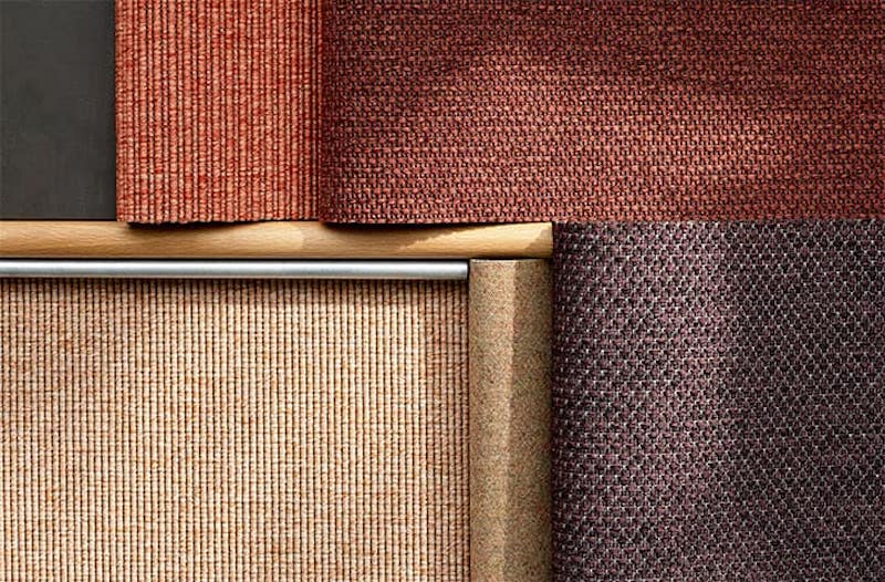
With her sensuous approach to carpet colours, Margrethe Odgaard aims at creating poetry in the floorscape. A professional colour hunter, Margrethe turns to nature as the primary source of colour inspiration and uses natural minerals which she turns into paint as the foundation for the process of development.
According to Margrethe, psychologists have documented, that living, breathing colours do more than appeal to the senses; they also boost memory for scenes in the natural world and thus enhance our sense of connectedness with our surroundings.
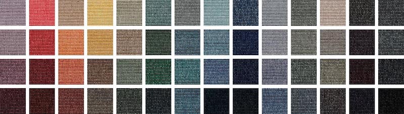
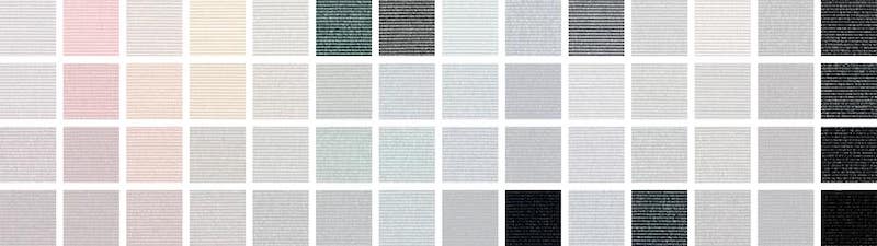
The 56 colours by Margrethe Odgaard
The fact that our carpet yarn is completely regenerable was inspirational to Margrethe who wanted to create colours that’re sustainable in an equal manner. Therefore, she focused on developing colours that don’t hold a given time in them but are able to move from one generation to another and have visual appearances strong enough to endure different trends.
Natural colours correspond well to one another and are easy to combine because each colour in nature holds details of other colours to a certain extent. – Margrethe Odgaard, textile designer and colour alchemist
Inspired by the beauty of natural minerals, Margrethe has created a range of colours that’re subdued and dusty as opposed to bright and bold – there’s a few of those but the main palette consists of discreet tints and shades as well as mixed colours. Like in nature, the exact colours can be difficult to define as they’re nuanced and complex and besides that, they respond to their surroundings. Therefore, they’ll appear differently during the day and create various experiences following the shifts in light sources.
These colours are developed to:
- Be thoughtful and poetic
- Be compatible with other colours and materials
- Bridge the gap between neutrals and colours
- Hold a built-in timelessness and thereby sustainability
Four colour groups
The palette consists of coloured neutrals, neutrals, social colours and diva colours. With this distinguishment between various colour types, Margrethe points out that colours bring different dynamics to the room.
In a colour decision making process, she therefore recommends considering the specific qualities of colours and not only relying your choice on your subjective opinion. According to Margrethe, it’s all about creating supporting and nourishing environments, and your ultimate colour therefore depends on your desired energy level.
1. The neutrals
The neutrals are the colours with least possible chroma or saturation. This group embraces the whites, the greys and the blacks and the neutral shades are all considered safe and emotionally silenced.
2. The coloured neutrals
The colour infused neutrals represent the coloured whites, the coloured greys and the coloured blacks. All of them hold a look and feel of sophisticated elegance and offer a beautiful activation of the light in the surface.
3. The social colours
Brown and dusty shades are defined as social colours, which means that they’re considered to be friendly colours that complement and elevate other colours and materials.
4. The diva colours
The saturated bright colours create vibrant and pulsating dynamics like a diva filling the space with a song.

Tips and tricks you don’t want to miss
- Choose a colour for what it brings to the room and not only because it’s your personal favourite
- Choose a colour from the colour group matching your desired energy level
- To start embracing colours in your interior design, you can create a smooth transition by focusing on coloured neutrals and social colours
- Choose colours inspired by the sensory qualities of natural minerals to ensure a timeless choice
- Don’t look at a colour individually. A colour is always part of a context (space, furniture, light etc.) when it’s out there working its function
- Cold colours address your mind and stimulate the ability to think and focus. Warm colours address your body and physical energies more directly and focus on wellbeing and presence
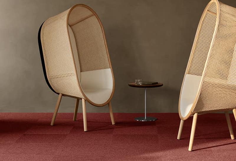
Colour examples
With the colour palette by Margrethe Odgaard, you can create poetry in the floorscape. In other words: through your colour choice you’re given a positive feeling to carry with you as you move on.
You might not be aware of this, but the ambience lives within you and affects your general state of mind. Below, you’ll find two examples showcasing how various carpet colours change the entire energy level and room atmosphere.
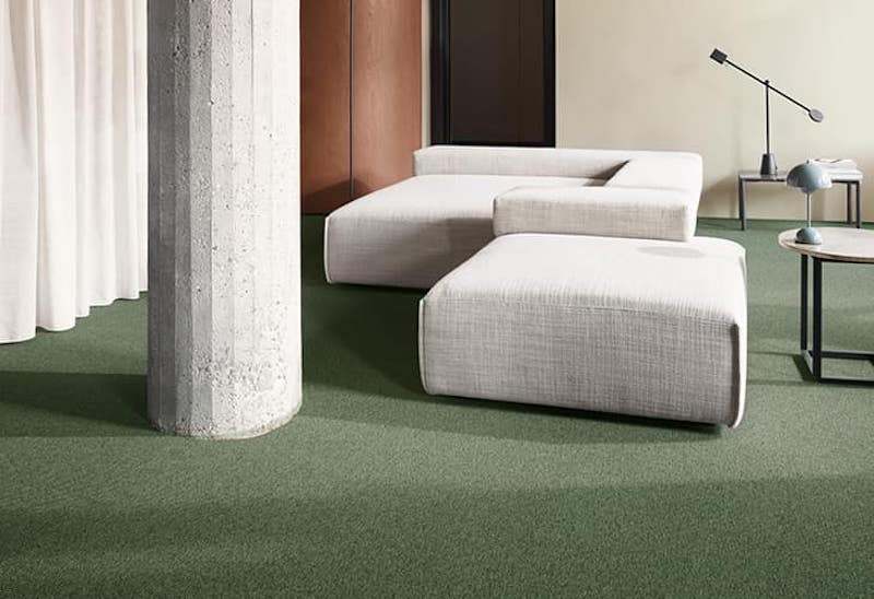
Colour example 1
A. Neutral colour with low impact

B. Coloured neutral with mild impact
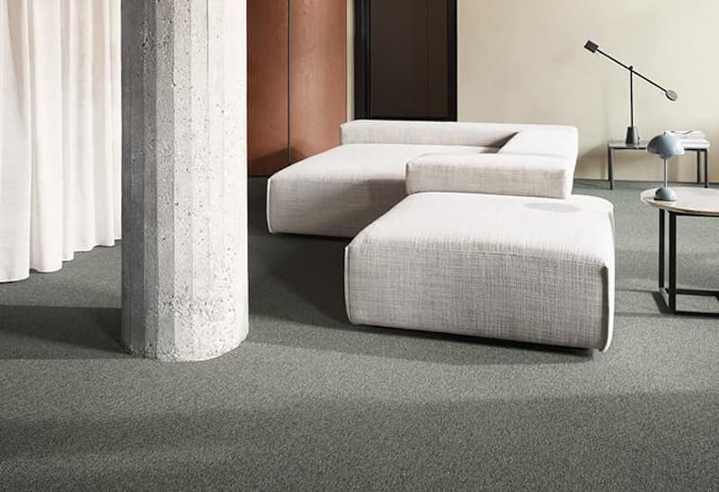
C. Social colour with grounding impact
D. Diva colour with invigorous impact
Colour example 2
A. Neutral colour with low impact
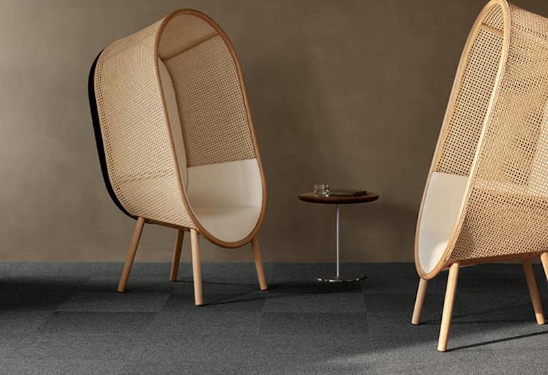
B. Coloured neutral with mild impact
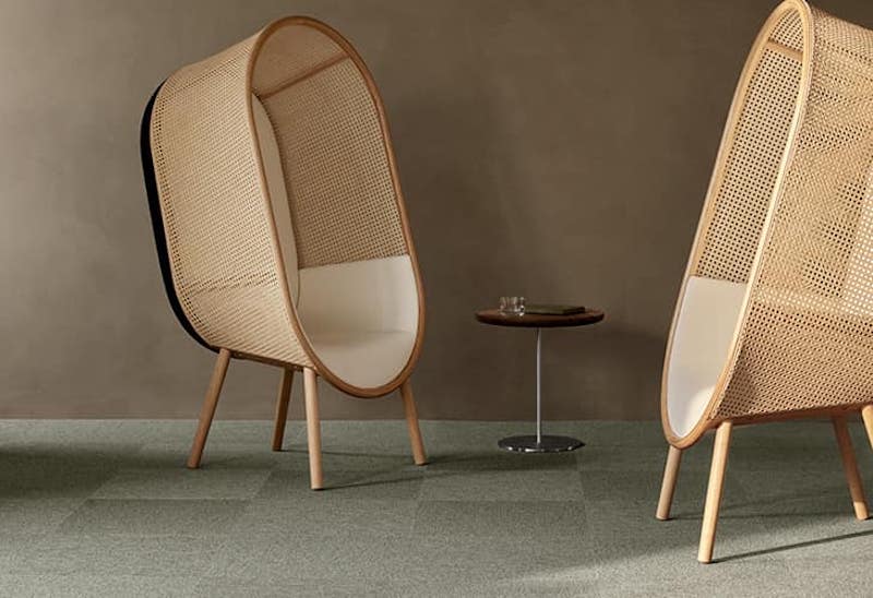
C. Social colour with grounding impact
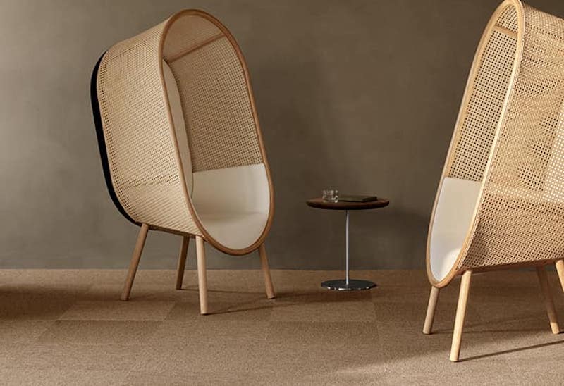
D. Diva colour with invigorous impact
By Mette Frydensbjerg Jacobsen


